
The smartwatch saga continues. Skip it if you are really not interested!
We left the story a couple of posts ago, with one alternative clock face chosen from a hundred or more that could be installed. This one. The hands turned green between 8.00pm and 7.00pm, so that I could be quite certain that night had come. In case I didn't know the difference between night and day.


Actually, I did rather like the way the hands changed colour during the evening and on waking up. It was something to look forward to, so empty is my life.
This first chosen clock face had the merits of simple design, no clutter (although I didn't mind the day and date), and good clarity. It had to be readable without my glasses on, and/or when half-asleep. But I wanted additional faces so that I wouldn't fall victim to boredom. I next found this clock face among the collection approved by FitBit:

That's definitely more elegant. But still clear and uncluttered. It had the advantage of showing the divisions for seconds, so that you could do a countdown - important when resetting the clocks in the house, car and camera twice a year, when British Summer Time comes and goes.
So far I'd selected two clock faces that were black. I thought black looked good, and besides, such a clock face was economical with battery power, there being no need to light up the black pixels on the OLED screen. And neither could dazzle me if I squinted at them during the night, when in bed.
How about a clock face that was white? So that it would show up well in bright sunlight? It took some looking, but I found one. It was designed for an earlier Versa model, and not the Versa 3, but the information on it said that it ought to work. And it did.

It was based on the typical German railway station clock. I think it's the best of the three clock faces I found. I've now got all of them installed on my Versa 3. I can keep up to five on the device at at any given time, and easily swap between them as the mood, or occasion, or time of day, takes me. My favourite for daytime use is definitely the railway clock. At night (certainly at bedtime) I switch back to the the first clock face I found, the one that has green hands after 8.00pm.
Speaking of station clocks generally, they are all absolute models of clarity. The railway companies that first installed these clocks would have got into trouble if passengers couldn't read them at a glance. They are therefore a very good model for a smartwatch clock face. All have thick black hour and minute hands that are impossible to confuse. All have bold hour and minute divisions. A hand for seconds may or may not be present, but if it is, it can never be mistaken for one of the other hands. On older station clocks there are nearly always big bold numerals, most often Roman.
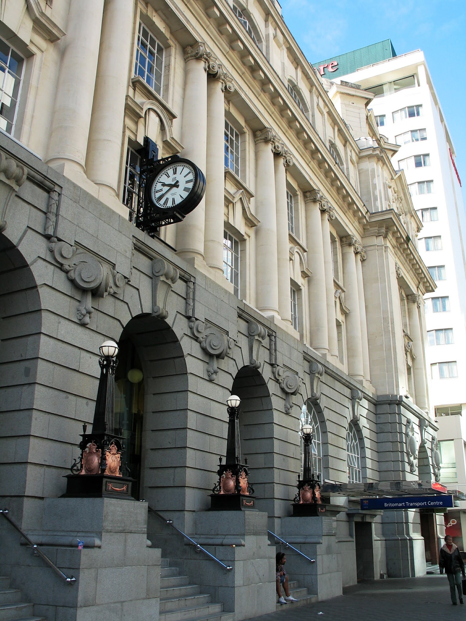
Here are some station clocks that I've come across, to back up what I say. Some are positioned on the station exterior, often on towers; some are positioned inside, near the actual platforms. Click on any of the photos to enlarge them.
Bognor Regis (taken in 1995):

Cleethorpes (1996):

London Waterloo (2000):

Eastbourne (2002):

London Fenchurch Street (2005):

Auckland Britomart, New Zealand (2007):
Dunedin, New Zealand (2007):


I couldn't resist showing extra shots of the magnificent station at Dunedin, which handles a lot of freight but, sadly, hasn't had an ordinary passenger service for years now. It serves only a tourist line into the interior of Otago.
Similarly I can't resist showing more than strictly necessary of the station at Wellington, New Zealand (also taken in 2007). But you do get two clocks:


Portsmouth Harbour (2008):

Liverpool Lime Street (2014):

Brighton (2014) - this is getting worse than a Where's Wally? picture puzzle:

Shrewsbury (2016):

Scarborough (2017) - another two-clocker:


Ditto, Newcastle (2017):


Bridlington (2018):

Beverley (2018):

Hull Paragon (2018):

Norwich (2019):


Great Malvern (2020):

Darlington (2021):


In this country, the traditional type of station clock survives mainly in the more important towns and cities, where the station is part of the local architectural heritage. The clocks are cherished accordingly, as the example just above, at Darlington station, makes clear.
I hope I've proved my point about the clarity of clock faces like these.
Hmm! It strikes me that I have the basis of a new photo project: public clocks - and not just at stations. Another reason to keep the little Leica handy on my travels!
