I'm a constant note-taker and recorder of events. Some of them are to do with my personal life, but there have always been more routine and mundane things to record. Nevertheless, these are things important for me to know and retrieve.
Consequently, I'm a heavy user of office suites for laptops and phones - collections of word-processing and number-crunching applications (and other apps for various business purposes) that make it easy to do much more - far more - than the sticky notes, diaries, notebooks, exercise-books, Filofaxes and columnar cash analysis books of yesteryear. Not that I'm dismissive of any of these things; I know people who stick with their leather-bound Filofaxes to this day, and if it suits them, that's fine.
But currently I have fifty-five essential Word documents and Excel spreadsheets that I use daily, or at least regularly, and I keep those offline on my phone, with multiple copies elsewhere. Then there are nearly 1,300 other documents and spreadsheets that I keep up in the Cloud, in Dropbox, as I don't need to see them so often. Rather a lot of notes and other records! And the only way to carry them around, instantly find what I want to look at or add to, and copy to other places so that they will be safe, is to maintain them in digital form. And use an appropriate office suite to view and update them.
Until 1999, I had a series of notebooks and analysis books to plan my spending and record the various money transactions; or to record where I'd taken photos day by day; and several other things besides. Then in 2000 I bought a desktop PC, and soon afterwards the first of many mobile handheld devices. For both PC and handhelds, I needed the appropriate software: an office suite.
On the desktop PC, I began with Wordperfect, but soon switched to Microsoft Office, which had the gold-standard Word and Excel. By May 2007 I was using MS Office 2000 Professional. For the last five years it's been MS Office Home & Student 2016, updated now and then by Microsoft. It was a single-payment offering, as I didn't want the financial drain of a monthly subscription that would stretch on indefinitely, eventually costing me much more.
I have tried several office suites on my mobile devices. The earliest, from 2000 to 2008, had to be compatible with the Palm handhelds I purchased and used, which ran Palm's own rather simple operating system. Then from 2008 to 2012 I used a Pocket PC that ran the much more heavyweight Microsoft Windows Mobile 6, and came with a version of MS Office Mobile built in. Thereafter, a Samsung Galaxy smartphone, running Android, with Google behind it.
One mobile office suite has stood the test of time: DataViz's Docs To Go, originally called Documents To Go.
Like Microsoft's office suite, it's been around for a very long time. I started using Docs To Go way back in 2004, on one of my Palms, but it was launched many years before then. Like MS Office, it gets overhauled every few years, although its basic appearance and functionality hasn't been altered. And I'm glad, because it's straightforward to use, and its rendition of Word and Excel is especially crisp and clear on a small phone screen - which, to my eyes, is not the case with MS's own mobile versions of Word and Excel. Google's equivalents, Docs and Sheets, are better designed and much nicer on the eye than MS's stalwarts. MS has tried too hard to bring big-screen functionality to the small screen, and consequently packs too much in. Google's offerings are easier and distinctly less clunky to work with.
But both MS and Google are unsuitable for my current needs. Both by default store (and backup) one's documents and spreadsheets to the Cloud, which is fine if (a) you live, commute and work in a city, where 4G (or 5G) and Wi-Fi are strong and ubiquitous, and (b) you need to share your work.
If on the other hand you're a retired private citizen living in the sticks, or on holiday in a farmer's field, where 4G is the only option and sometimes rather iffy, then dependence on Cloud storage isn't a good idea. Nothing is more frustrating than wanting to look up something, or save something after updating a record, than to find that no Mobile Internet is available. That's chiefly why I prefer to store my key documents offline, and yet be able to switch them in and out of the Cloud with ease, whenever possible. And indeed work with all my documents, offline or in the Cloud, from one application. Docs To Go allows that.
Offline working, incidentally, has other big advantages apart from the documents being stored on the phone, and therefore directly accessible. They will open and close at lightning speed. There's no waiting while they are fetched down from the Cloud, or sent back. And the processing power on my new phone, Prudence, just adds to that swiftness. It saves time and irritation.
So what does the venerable, but still highly usable, Docs To Go look like? Here's a screenshot of part of my offline Money Diary 2021 spreadsheet (click on the image to see its proper crispness):
Or, in landscape mode:
Here's another screenshot, showing future transactions. My routine income and expenditure is so predictable, I can plan up to two months ahead - and often do, if heavy expenditure looms, such as going on holiday. This is the same spreadsheet, but for part of May, two months away:
I think you'll agree that the rendition of this Excel spreadsheet is crisp and clear. Docs To Go has an uncluttered look, which allows more of the spreadsheet to be seen on the small screen. Microsoft's mobile Excel and Google's Sheets have ribbons or bands with various operating and editing icons on them, which intrude into the available space. Google does it more economically, but I'm still not a fan of sundry little icons to tap on, especially when some are similar to others, or they aren't all that clear to see on a little screen. What works fine on a laptop, where there's a lot of screen space, doesn't necessarily work well on a phone.
So how do you do anything in Docs To Go? Using menus. Either by tapping the three horizontal blue bars at the top right-hand corner of the screen - which brings up the top level of a general menu - or by a long-press on the cell you want to edit, which brings up the top level of a contextual menu for that cell.
Thus the general menu:
If the Insert submenu is selected, you see this:
I said that Docs To Go is 'straightforward' but there's actually a lot of functionality hidden under the surface, quickly got at, provided that using menus agrees with your preferred way of doing things. Some people don't like them. I notice that present-day tech reviewers certainly don't, possibly because they want to seem cutting-edge and on trend. But the only alternatives to a hierarchy of menus are those pesky on-screen icons, or talking to the phone. Although I'd hate to say 'Prudence, enter this formula in cell AA231...' and expect a good outcome. Remember, I'm almost sixty-nine with slurred speech, a lisp, a strange accent, and no doubt I dribble saliva quite a bit. My phone might interpret whatever I said as 'Delete this spreadsheet and all copies!' Well, it might.
The top-level cell menu looks like this:
And choosing the Format Cell option brings forth:
Again, I think this is clear and easy to work with. I'd rather read words, than figure out what symbols and icons mean.
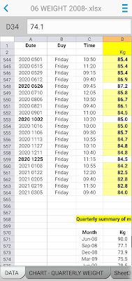
If there is one thing that Docs To Go doesn't do so well, it's graphs. Let's look at another offline spreadsheet, the one for recording my weight, which has been maintained continuously since mid-2008 when I was a 90kg fatty. Gosh I then weighed 198 pounds! Yikes! No wonder I embarked on a crash diet. After a doctor's warning, I put weight back on, and then it soared to 97kg by August 2016 - 214 pounds! - before I joined Slimming World, and brought it down again. Since leaving SW in early 2018, some weight has gone back on, but my ongoing use of their eating regime has kept my weight in the 82-86kg range.
Anyway, I take the quarterly results to a separate list, from which a chart is generated. However, tapping the chart tab at the bottom of the screen, merely shows me this:
No chart! What you have to do is tap that 'chart' symbol at the top right, then you get:
Still no chart, but you obviously have to tap on the bar with 'Quarterly weight' on it. I suppose you could conceivably have several charts in the one spreadsheet, so this is the screen where you choose between them. Tedious, of course, if there is only one chart...
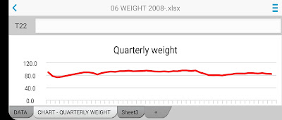
Ah, finally. The 'portrait' version shows big ups and downs over the years - each point on the horizontal axis is presumably three months - while the 'landscape' version suppresses the weight variation into a gradual rise and fall, suggesting also that my 'natural' weight - what nature intends - is around 80kg and that I should aim for that and not strain to do better. So I will stay technically plump and meaty, but mentally comfortable! Some of my female friends have ten-stone frames. Well, they can flaunt their featherweight physiques as much as they like; I shan't mind.
These graphs are for display only, and show only general trends. Useful enough, but limited because not editable. (You have to edit in Excel on the laptop) So I wouldn't praise Docs To Go for its charting abilities. But then again, this is not a deal-breaker for me.
What about Docs To Go's rendition of Word? Well, here's a screen shot of my Car Diary from 2020:
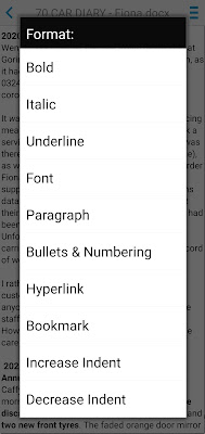
Perfectly crisp and clear again, and uncluttered as before. To add or insert text, you simply position the cursor with a tap, and the keyboard appears. Other options are reached with a tap on those three horizontal blue lines in the top right corner. Suppose I want to see the Font menu, two more taps will get me there, via the Format submenu:
So there we go. A glimpse of what I use to get everything done. One app for both my offline and online stuff.
And what if Docs To Go ever folds? Do I go for Microsoft or Google? With all my Word and Excel creations stored in either OneDrive or Google Drive?
Not much to choose between them, for a single user like myself, who doesn't want to share her work. I'd probably go for Google, because their apps are free, visually nicer and a little more convenient to use. And of course, Google's apps snuggle up to Android on the phone very well indeed.
It is possible to work offline with both; and in Google's case new documents, or amended old ones, can be saved to the device if not connected to the Internet. They save to the Cloud later on, when there is a connection. Whether this enables effective, permanent, offline working, I'm not sure. At the moment, there's no compelling reason to find out. But perhaps I should investigate, just in case I need to act in a hurry.
Mind you, within a few years there should be no problem with Cloud access, anywhere in the country, as 4G should be sizzlingly good in all places except St Kilda, Rockall and Sula Sgeir. I won't need to resort to offline working except for very exceptional circumstances. Nor, as 5G spreads ever more widely, will I necessarily miss that lightning-quick opening and closing of files I get with the offline way of doing things.


