Actually, this is the view after I tweaked it somewhat, to maximum the file-name space. Originally, columns for 'who had last changed the folder or file, and when' and 'what kind of file' were also visible, and frankly it all looked pretty crowded on the laptop screen.
I've now simplified this 'home' screen as far as I can. But the leftmost and rightmost sections of the view are a waste of screen space, so far as I am concerned, and they can't be collapsed. And to open a folder, or a file, now requires a double-click, not a single one - something of a retrograde step, in my opinion.
You can change the view to the good old no-frills Windows Explorer version, which of course looks like this:
But that introduces an extra step. I'll be doing it for the purposes of making my three-day manual Document and Spreadsheet backup, but probably not otherwise. I am determined to get used to Dropbox's new interface, and see whether it offers useful advantages that I haven't yet noticed.
That 'home' screen can't show all my folders, which as you may notice bear the number-prefixes and category titles shared with my calendar app and to-do app. So half the time I have to scroll down to find the folder I want to open:
As already mentioned, you double-click on a folder to open it. Let's select '3 PHOTOGRAPHY':
The rightmost section now displays some information about the folder, and some 'action buttons'. None of that is any use to me. Let's double-click on the folder and open it, then scroll down to a Word file titled '31 Cameras 6 - LEICA D-LUX 4', and select it.
Once again, the right-hand section contains information and action buttons.
You can see how I use prefix numbers to organise my files, bringing all files for a particular topic together. It's a scheme I devised long ago, in the year 2000, and tweaked for life-changes and tech-changes since then.
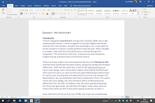
Now I'll double-click on '31 Cameras 6 - LEICA D-LUX 4' and finally open this file, which I can now read, add to, and edit. This is the proper Microsoft Office view, not Dropbox's.
In the course of the eleven years that I've owned the little Leica, this document has grown hugely. It has become a vast essay on its technical capabilities, how to do things with it, the settings I've tried, and what I think of it as a photographic tool.
I've written about all my digital cameras in this way. Bottom line: I just like writing essays.
From here it's easy to open other files simultaneously by clicking on the word 'Dropbox' at the top of the leftmost section.
Well, that's a short tour. I've got the hang of it, although if there is a comprehensive settings button, I haven't yet located where it is. Meanwhile the new Dropbox is perfectly usable, although navigating it is a bit long-winded if I just want to (say) make a small addition to a spreadsheet. To do that, I will probably now make even more use of the Documents To Go app on my phone, which links with Dropbox, and presents its own version of those Word, Excel and PDF files.
I find it quicker and simpler to use. Everything's one-tap; and although DTG's versions of Word and Excel are slimmed-down compared to the full blown Microsoft Office version - which actually makes using them easier - the look is much the same, and all the essential features are still covered. The only disadvantage is the phone's much smaller screen. You can't see the whole of any document or spreadsheet, and always need to scroll about. But that's fast to do on a phone.
These are the DTG views you see if navigating to, and opening, the '31 Cameras 6 - LEICA D-LUX 4' Word file on the phone screen:
I prefer to work on documents with the big-screen laptop, so that I can see more of the text, and use the very good Microsoft Surface Book keyboard. The same for spreadsheets. But DTG on the phone isn't far behind in usability. And I can shortcut Dropbox's new interface that way.
It's obvious, of course, why Dropbox has made this change. Their new interface is very suitable indeed for remote working - the sharing and editing of project work jointly prepared by a team, with a means of submitting the final cut to management for approval.
Clearly they were going to slant Dropbox in this direction as the next step. How timely for people forced to work at home by the coronavirus pandemic! And since Dropbox couldn't have concocted this overnight, well done them for having it ready now, when so badly needed.
The new interface isn't primarily for people like me. But it doesn't matter. One can adapt.


